
SALVIN:
Brand Identity
BRAND GUIDELINES + CAMPAIGN
Salvin is a leader in the dental product industry. With over 50 years of expertise, they provide oral surgeons, periodontists, and implant-focused dentists the surgical supplies and materials they need to succeed.
Over the years, the brand identity has fallen behind the times, and they were looking for a refresh to showcase their dominance in their market space as well as promote their ongoing commitment to excellence and cutting-edge products.

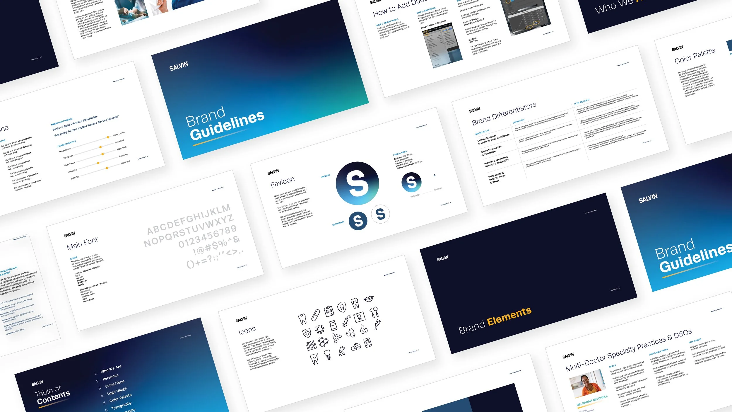
DETAILS:
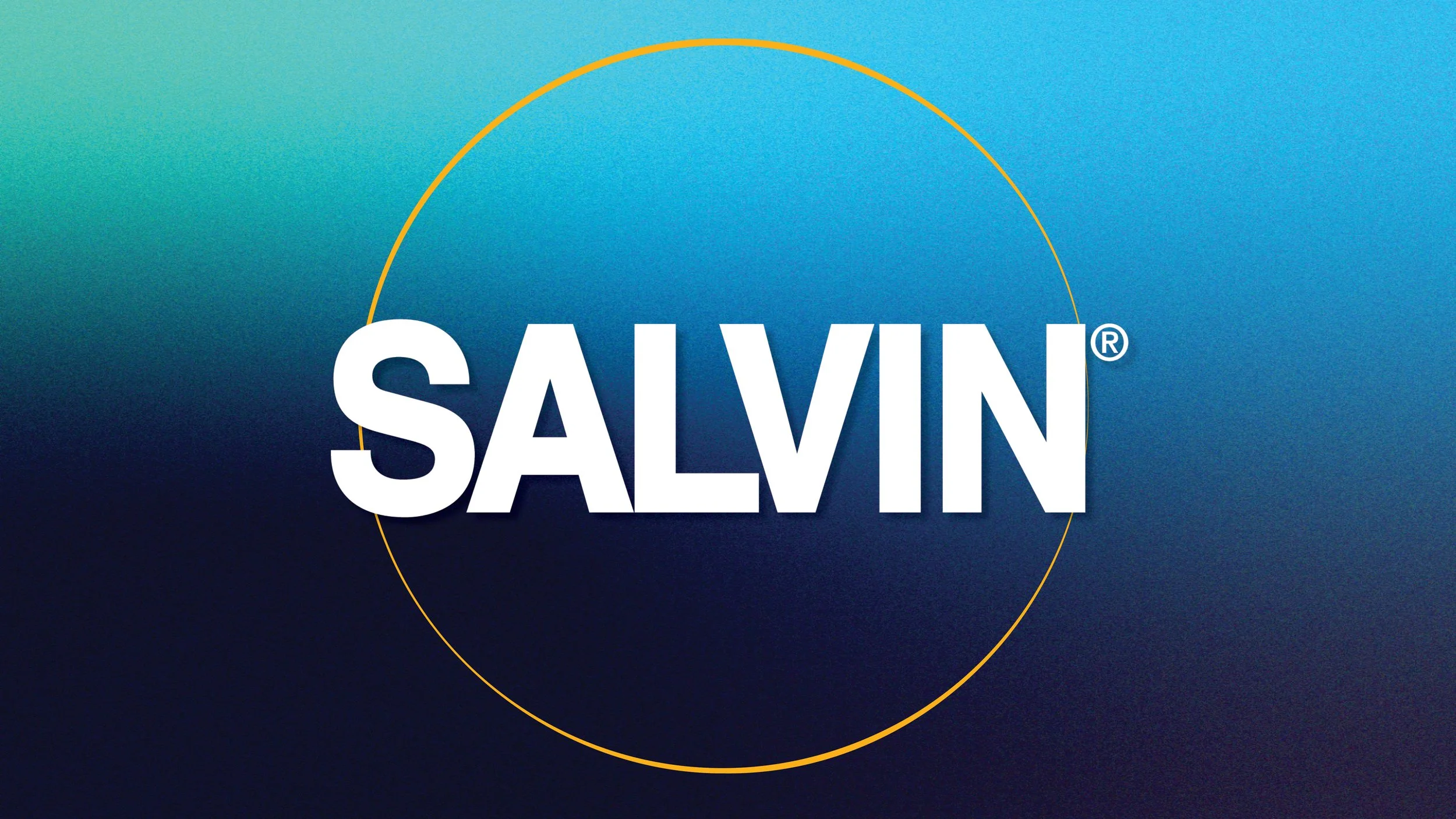
Logo stays the same to keep brand recognition
through the transition
Texture and grain is added to reference the biomaterials and metal products they sell. It also adds depth to any collateral piece, just like their experience adds depth
Big, bold imagery and colored gradients catches your eye – a unique feature in their market space
Friendly photography invites people in – makes them feel like they are in good hands
Detail call-outs help showcase product benefits and other facts customers might need before purchasing, showcasing the expertise of the brand
Colors focus on the blues associated with the dental market, while bringing in a pop of bright yellow and
green to promote forward growth and future-thinking


